Project background
Opened as a state-of-the-art private healthcare venue in 2004 Galway Clinic was the leading healthcare institution in the West of Ireland. Our marketing and design agency was approached with a with a significant challenge: their outdated branding and image identity were no longer resonating with their target audience and the hospital was struggling to maintain its competitive edge in the ever-evolving healthcare market. Our task was to create a compelling rebranding strategy that would not only revitalise their visual identity but also reflect their commitment to advanced medical care and exceptional patient experiences.
Objective
Our goals were to establish a modern and distinctive visual identity that reflects the hospital’s values and commitment to excellence. We also needed to enhance brand perception among existing and potential patients, positioning the Clinic as a trusted provider of state-of-the-art healthcare services. We hoped that this would Increase patient admissions by creating a more appealing, approachable and human brand image and strengthen the hospital’s competitive position in the regional healthcare space.
Skills
Branding
Print Design
Concepts
Advertising Campaigns

The Approach
Research and Discovery: Our team conducted an in-depth analysis of Galway Clinic’s current branding elements, market position, and target audience. We also studied the competitive landscape and gathered insights through surveys and interviews with hospital staff. This research phase helped us identify the core issues and understand the aspirations and expectations of both internal and external stakeholders.
Strategy and Concept Development: Armed with valuable insights, we developed a rebranding strategy. Our core concept focused on aligning the hospital’s visual identity with its core values of innovation, compassion, and personalised care. We aimed to strike a balance between professionalism and warmth, ensuring that patients would feel comfortable and confident in their choice of healthcare provider.
.


The work
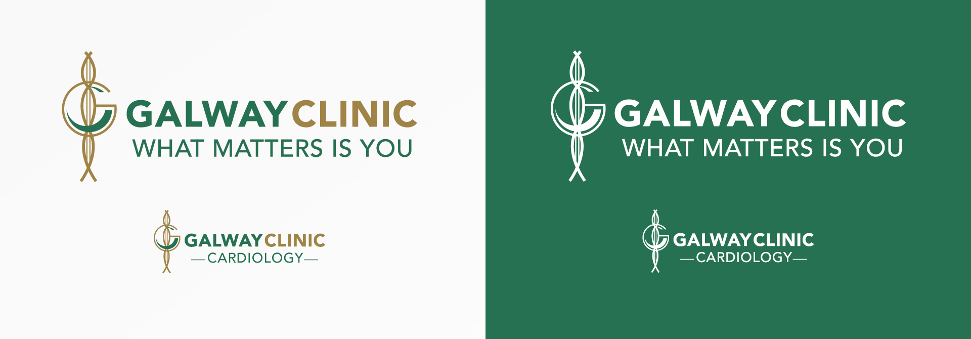
We started the rebranding process by refreshing and modernising the logo which we ascertained had good brand recognition in the market. The was combined with overall new cleaner typography with a new. less clinical graphic language inspired by the hospital’s staff and patients. The result was a warmer more human image that represented the hospital’s commitment to personal care.
We carefully selected typography that focused on legibility as many of the target audience were in the older age demographic. This was to ensure clear communication across all brand touchpoints.
To revamp the hospital’s visual assets, we developed a comprehensive set of design elements and a new visual language. These assets adhered to the new refreshed identity, contributing to a cohesive visual look that resonated with patients and staff alike.

Concepts
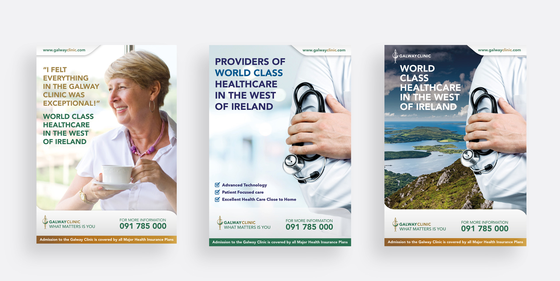
My role involved the evolution of many new concepts in the brochures and in advertising and promotional campaigns. Working alongside my own marketing team and the hospital marketing team I was at the forefront of many of the ideas and copywriting.


Results
The rebranding efforts for Galway Clinic yielded good results at the time. The modernised visual identity has successfully captured the attention of the target audience and addressed the hospital’s previous image challenges.
Conclusion
Several years after the project was completed Galway Clinic was bought by the illustrious Blackrock Clinic group of hospitals and it’s identity and place in the market has absorbed by it’s new owners. Working with a private hospital with it’s many stakeholders and focus on business was an interesting challenge and I learned a lot about the business and that particular model of healthcare.


